2023–2025
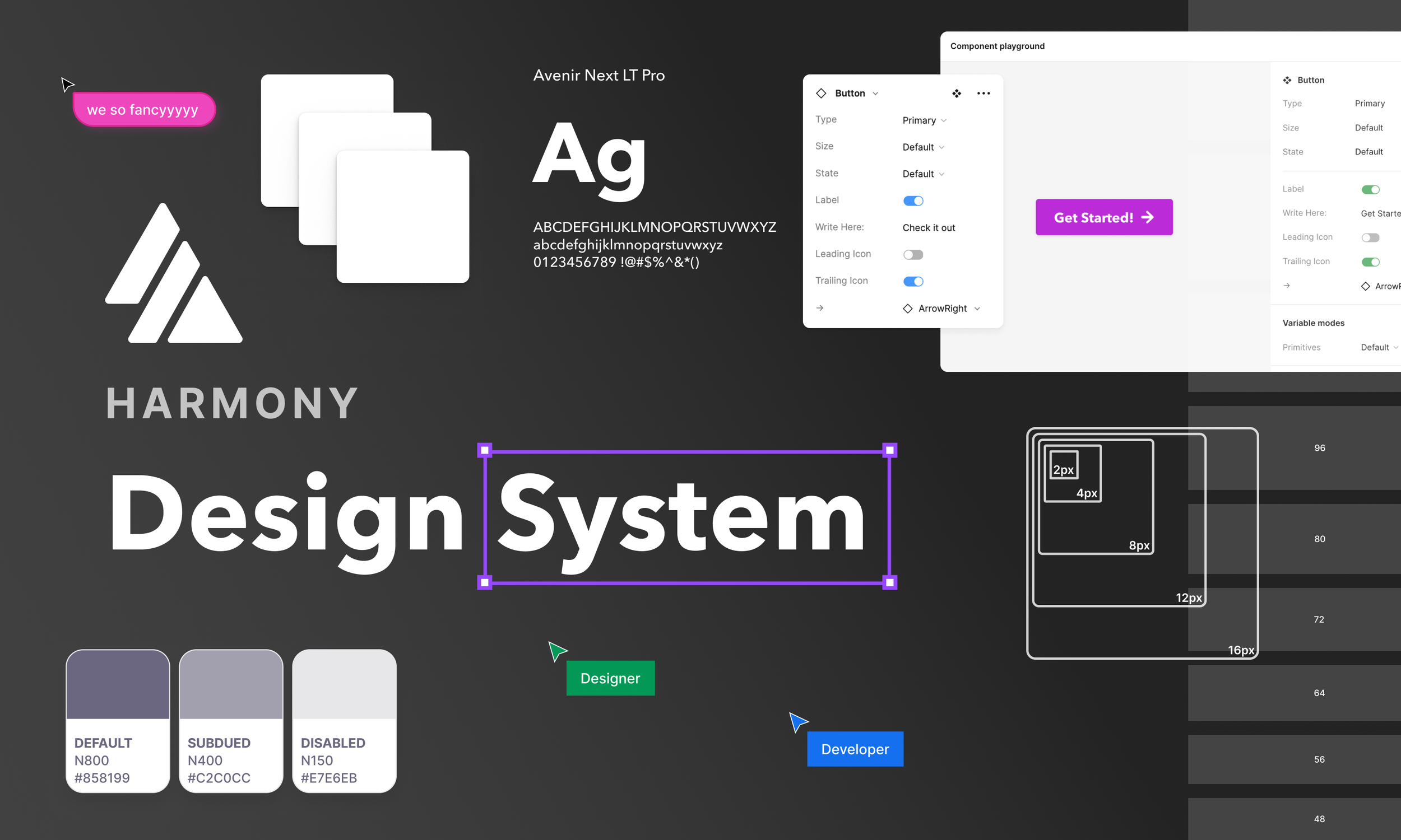
Harmony Design System
Audius · Lead Designer
The app worked. It just didn't hold together.
When I joined Audius in October 2022, the product was live and growing. But the moment I opened the design files, the problem was obvious. Modal headers in four different styles. Buttons with inconsistent sizing and color across different parts of the app - not because anyone decided that, but because a stakeholder would lean over the only designer's shoulder and say "make that button bigger," and nobody ever went back to fix it. Typography was the worst of it: no clear hierarchy system, just hardcoded values everywhere, each screen a slightly different interpretation of what a heading should look like.
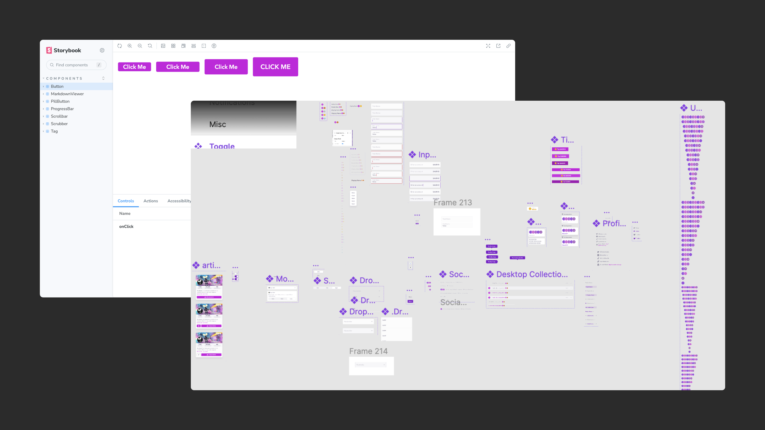
Engineering had a Storybook, but barely - a pill button, a few local components. Nothing you would call a toolbox. Design and engineering were working in opposite universes with nothing bridging them together. Trust between the two teams was low, and building it was slow and expensive.
Within my first week I told my boss and Head of Design, Julian: “this is going to have to change.”
Step one: understand what we actually had
Before building anything, I audited everything.
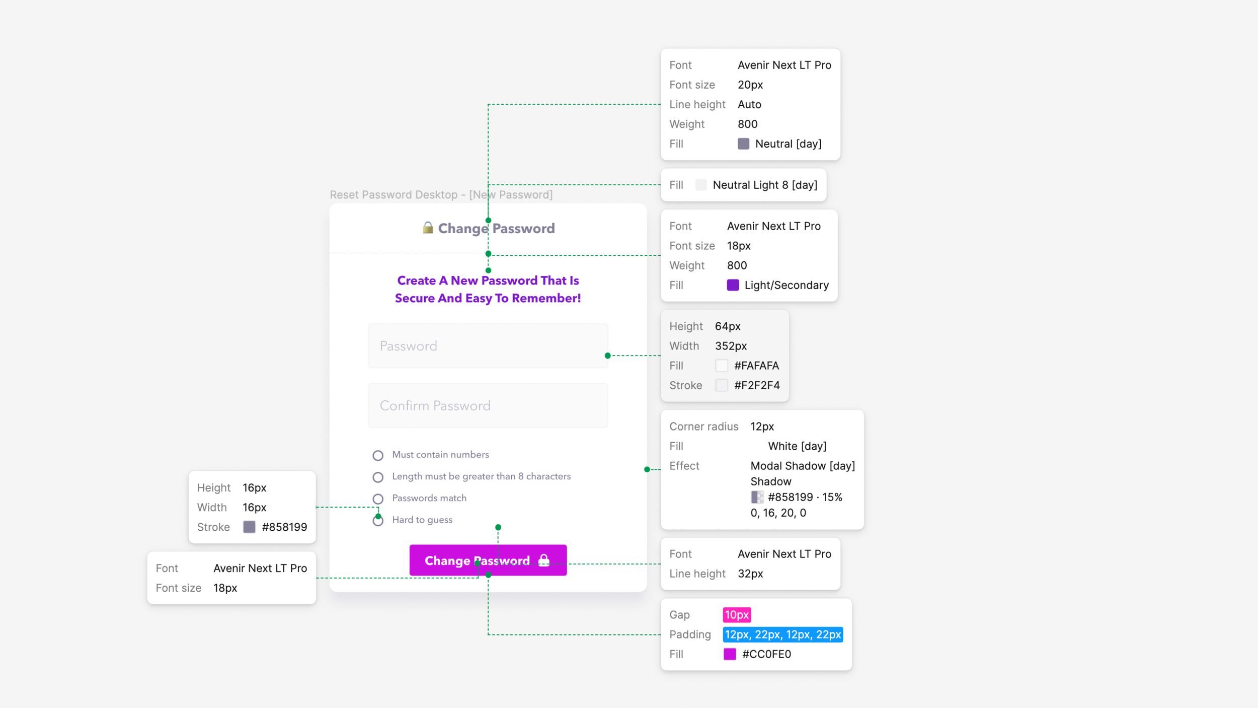
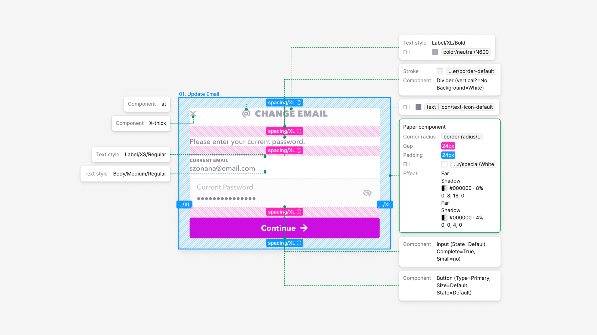
I went screen by screen through the app and mapped every text style in use - not by size or weight, but by role. This is a heading. This is a subtitle. This is a button label. I needed to understand what the product was actually doing typographically before deciding what the system needed to do. The audit made the problem concrete: we had dozens of one-off text treatments that could be collapsed into a handful of intentional, reusable styles.
From there I built a full component inventory. What did we have? What was missing? What was being rebuilt from scratch every time someone needed it? That list became the foundation for everything that followed.
Getting engineering in the room
With the audit done and a clear picture of what we needed, I brought engineering into the conversation.
In May 2023 I facilitated the first Harmony workshop - an offsite with the front-end engineering team. The goal wasn't to present a system I'd already built. It was to build a shared, prioritized list of what mattered most. What components did engineers reach for constantly? What kept slowing them down? What did they want to own?
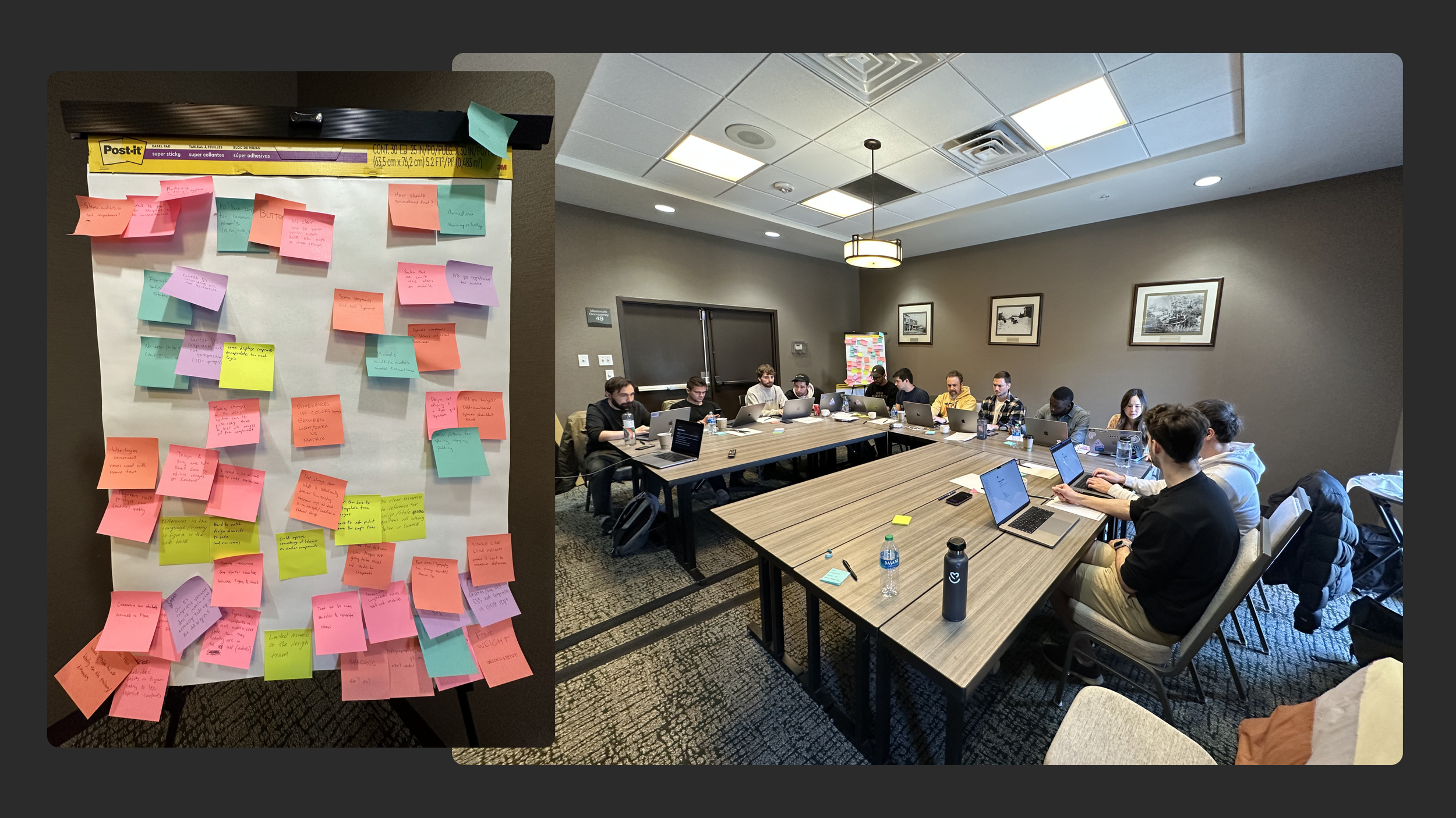
We left with a prioritized backlog. Engineers knew what was coming and had shaped the order. That changed the dynamic entirely.
Building alongside feature work
We didn't have a dedicated design system team. What we had was a small group: mostly me, Julian, and our lead engineer Dylan - with others coming in and out. Waiting for a dedicated sprint to build everything wasn't realistic. So we built a different approach.
I created a decision framework in Notion for every design handoff: does this component exist in Harmony? If yes, use it. If no, do you want to build it? Engineers had the option to contribute components as they encountered them in feature work. If they needed a radio button and it didn't exist yet, they could build it and it would go into the library. Our head of engineering did exactly that.
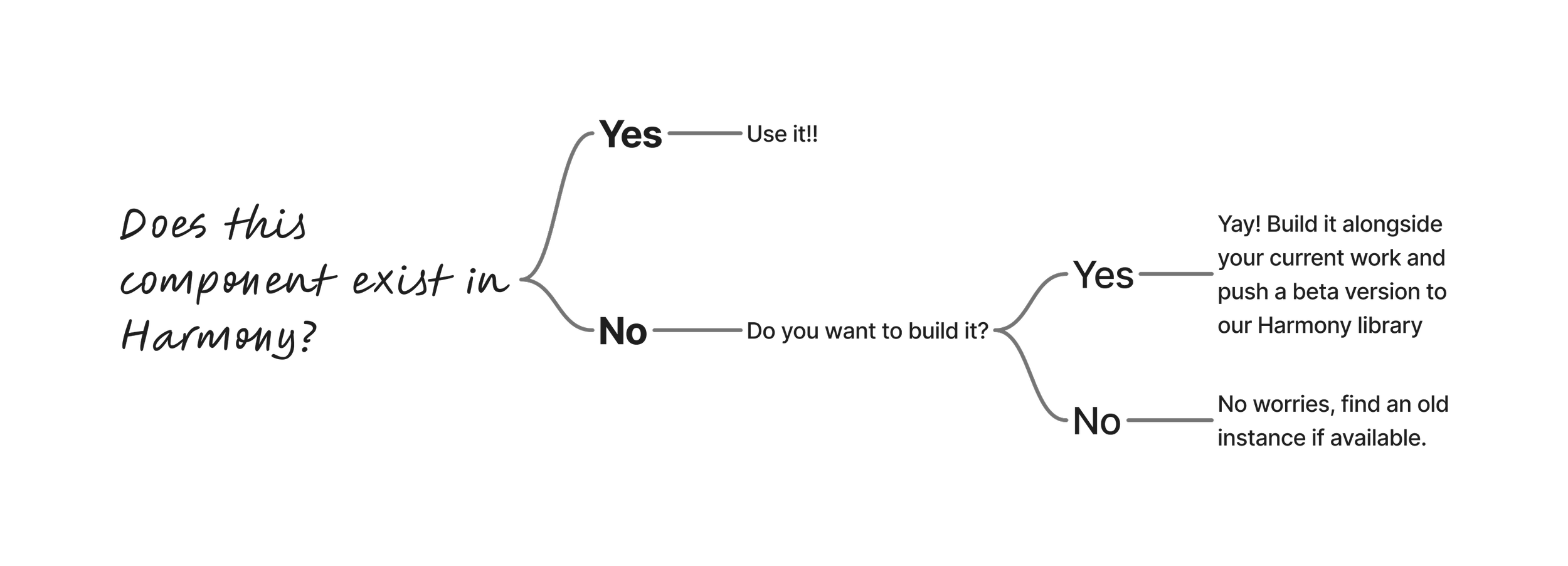
Engineering bandwidth meant there was a gap between what existed in Figma and what existed in code. We named it openly and built a system around it rather than pretending it wasn't there.
This approach meant the library grew organically alongside the product. Components started in beta, contributed by whoever needed them first, and got pushed to stable as we had capacity to review and finalize them. When engineers contributed a component I'd post a custom certificate in Slack calling them out — small recognition that made the work feel shared, not assigned.
I ran a second workshop in March 2024 as a follow-up/retrospective to keep the momentum going, adjust based on what the team was actually running into, and make sure adoption stayed on track.
The dedicated sprint: shipping harmony.audius.co
When engineering bandwidth finally opened up, we used it to push everything over the finish line.
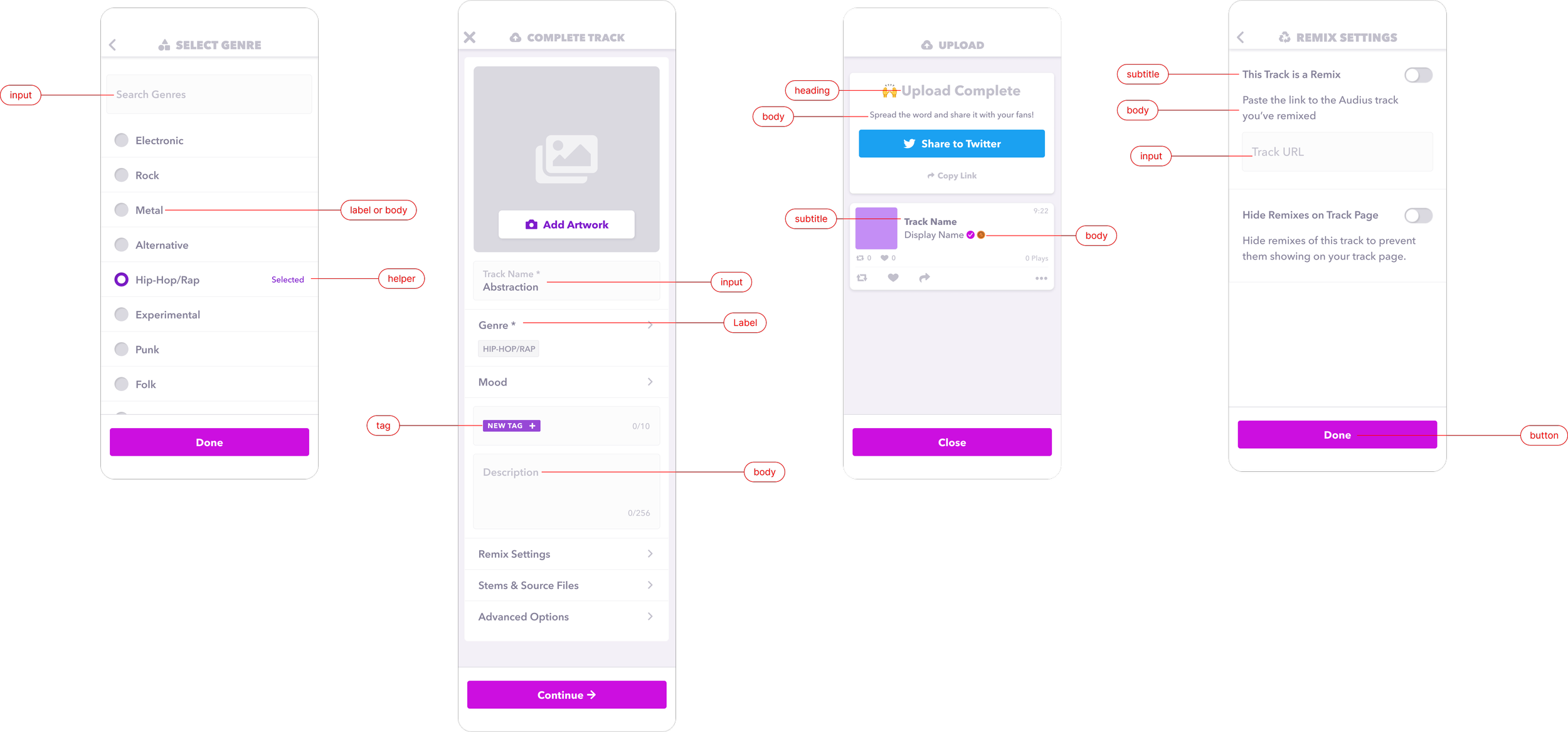
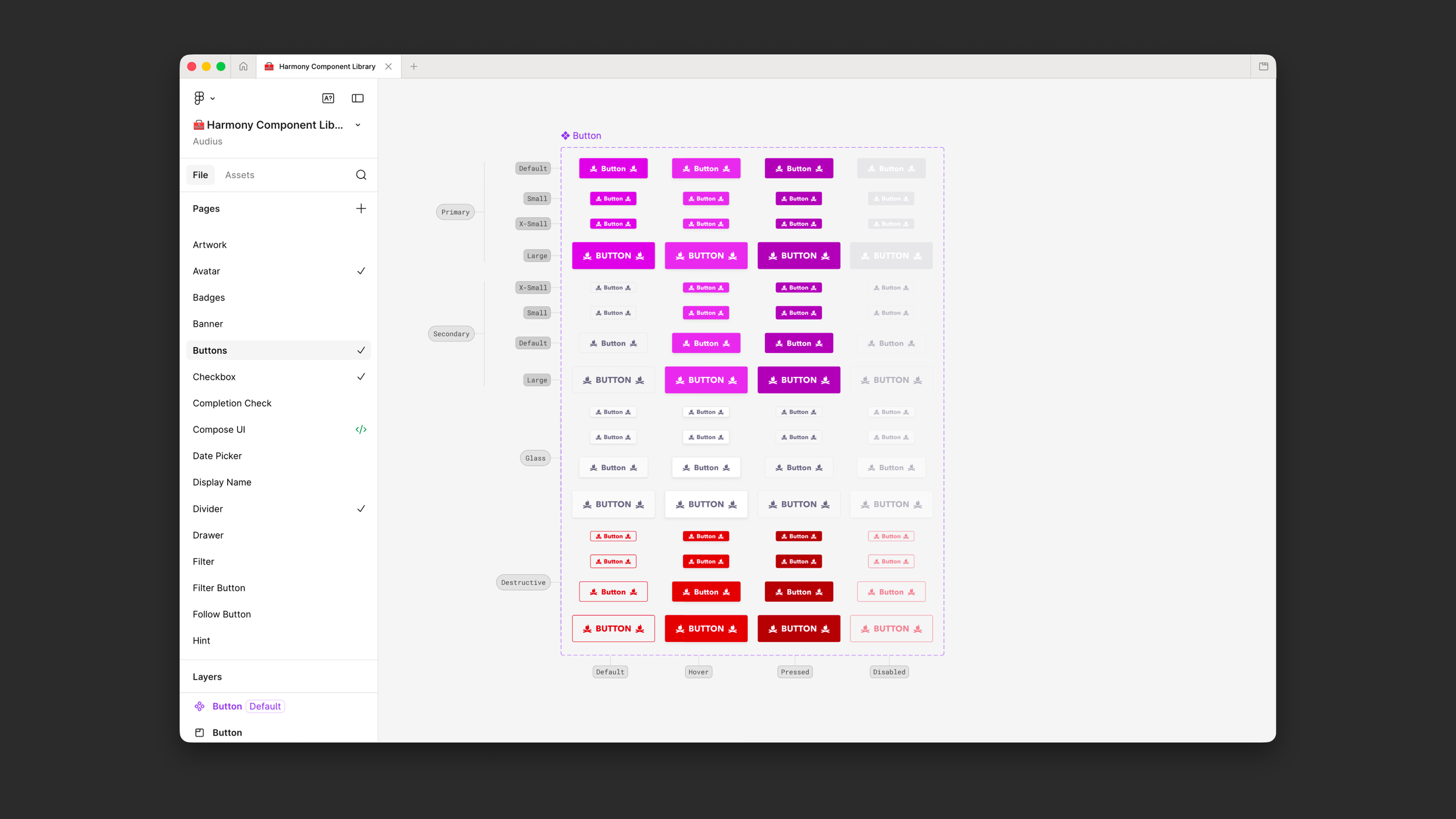
Dylan and I worked closely to finalize the components that had been built but not yet stabilized, complete the documentation, and ship harmony.audius.co - a live, public-facing site where every component lives with its props, variants, states, and usage guidance. Engineers didn't have to ask what a button does. They could look it up, copy the code, and ship.
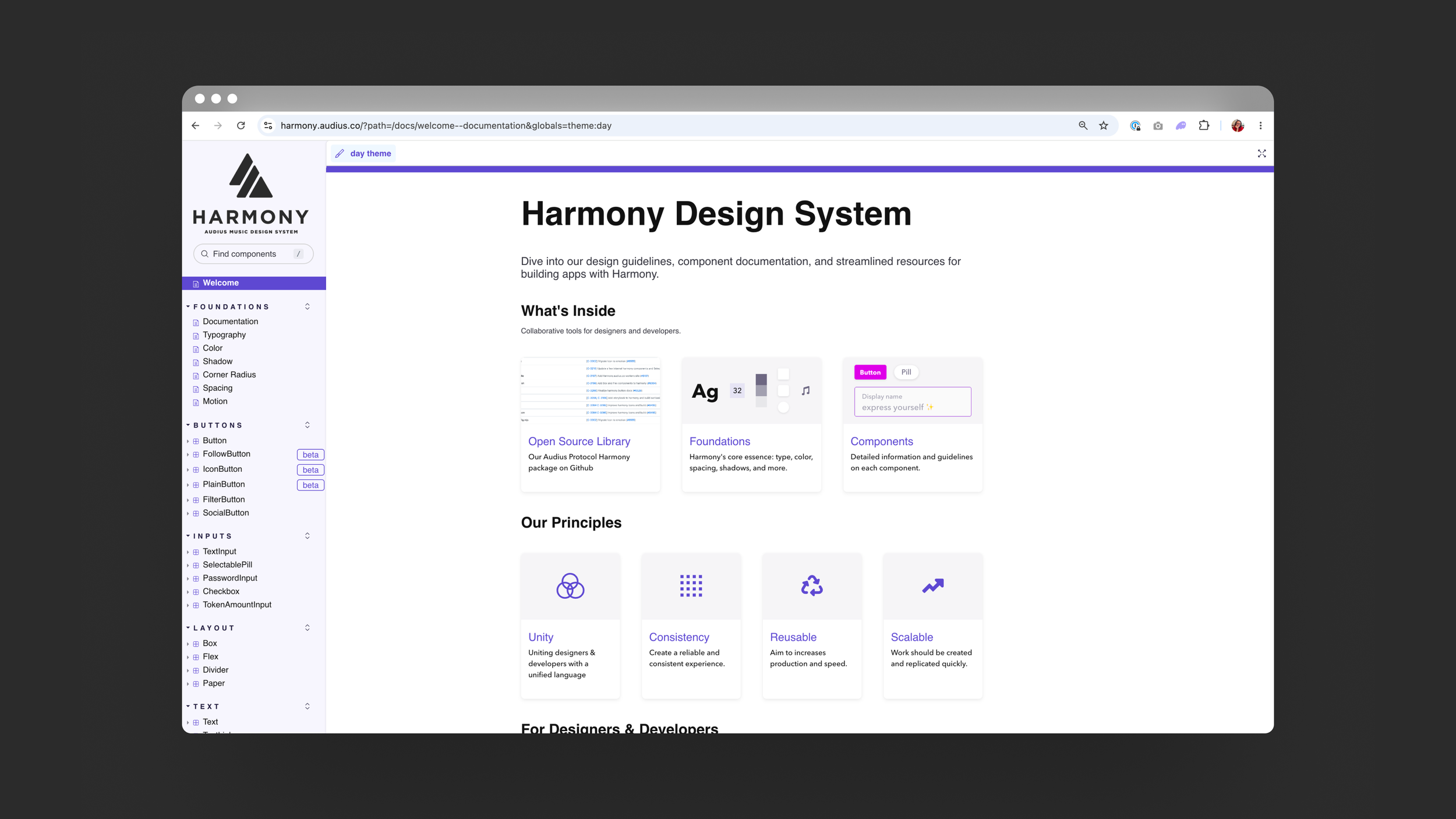
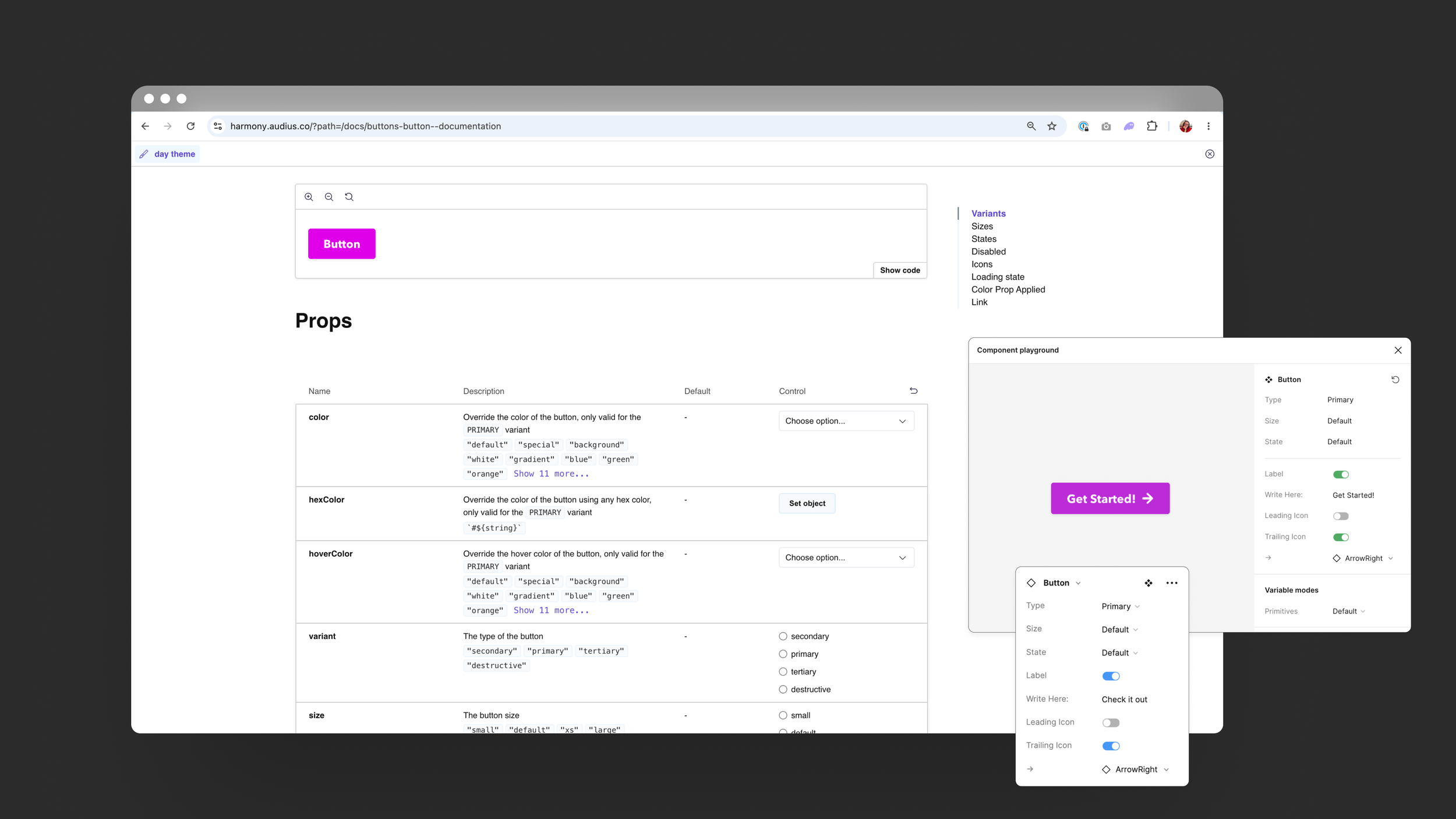
The site became the single source of truth for both design and engineering. When a new engineer joined, Harmony was their onboarding document. When a designer handed off a spec, Harmony was the reference. It removed a category of back-and-forth that had been constant before.
The moment I knew it had worked
The first signal came at a company hackathon. Engineers presented their projects and something was different - the interfaces looked genuinely good. Not "good for a hackathon." Just good. Julian pulled me aside afterward: they've never looked that good.
They didn't have to make design decisions. They just built.
The second signal came from Marcus, one of our engineers, after the button and input components had shipped to production.
And from Saliou:
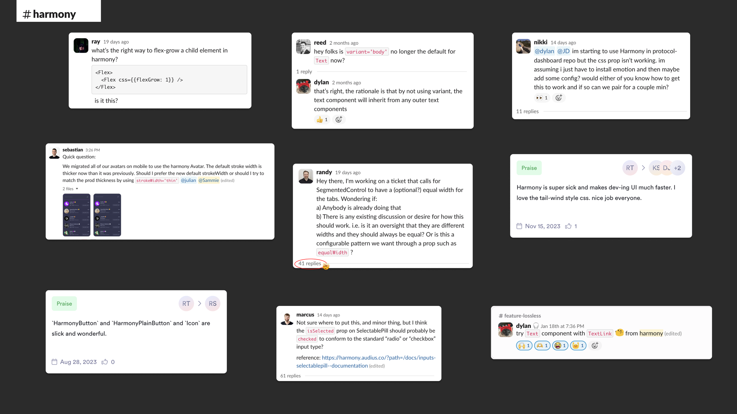
In addition, the #harmony Slack channel became a living hub for the system - engineers filed implementation questions, flagged inconsistencies, proposed new patterns, and left unsolicited praise. That level of organic engagement was a signal that the system had become genuinely useful, not just officially mandated.
What Harmony unlocked
The immediate impact was velocity. Development time on component-heavy work dropped by roughly 50%. Engineers stopped making visual decisions they shouldn't have had to make. Designers stopped fielding questions about spacing and color that the documentation already answered.
The longer-term impact was bigger. When Audius began integrating AI-assisted coding into our workflow - engineers generating and shipping code at a pace we hadn't seen before - Harmony was already there. The system was ready. Components were consistent, documented, and reliable enough that AI-generated code could use them correctly. We hadn't planned for that. We'd just built something solid enough that it held up when the pace changed.
Before and After
Live site: harmony.audius.co
Role: Lead Designer — audit, Figma library, token architecture, documentation site, workshop facilitation, adoption strategy
Timeline: 2023–2025