February 2025
Buddy: Brand & Product, 0→1
Lead Product Designer for Startup

Project Summary
In January 2025, I joined Buddy as the sole senior product designer for an early-stage cannabis startup. I owned two things at once: building the brand from nothing, and turning a rough MVP into a shippable product. This case study focuses on the brand work — logo, color, typography, and how I got a founder to let go of a brand he was emotionally attached to.
My Role
Lead Product Designer (sole senior designer)
Defined product vision, UX strategy, and full visual redesign
Created design system + tokens, component library, and interaction patterns
Built end-to-end flows (onboarding, matching, product discovery, profiles, shopping)
Partnered tightly with engineering to sequence work and unblock development
Delivered final Figma file
The Starting Point: A Fragile MVP
When I joined, Buddy’s MVP looked and behaved like a rough proof of concept. It suffered from:
No design system or visual consistency
No brand direction
Disjointed navigation and incomplete flows
Painful usability issues
Limited features and unclear value prop
Engineering blocked because there were no build-ready UI foundations
It wasn’t really a product yet - it was an idea with a few screens.
Building a Brand From a “B” and a Green Palette
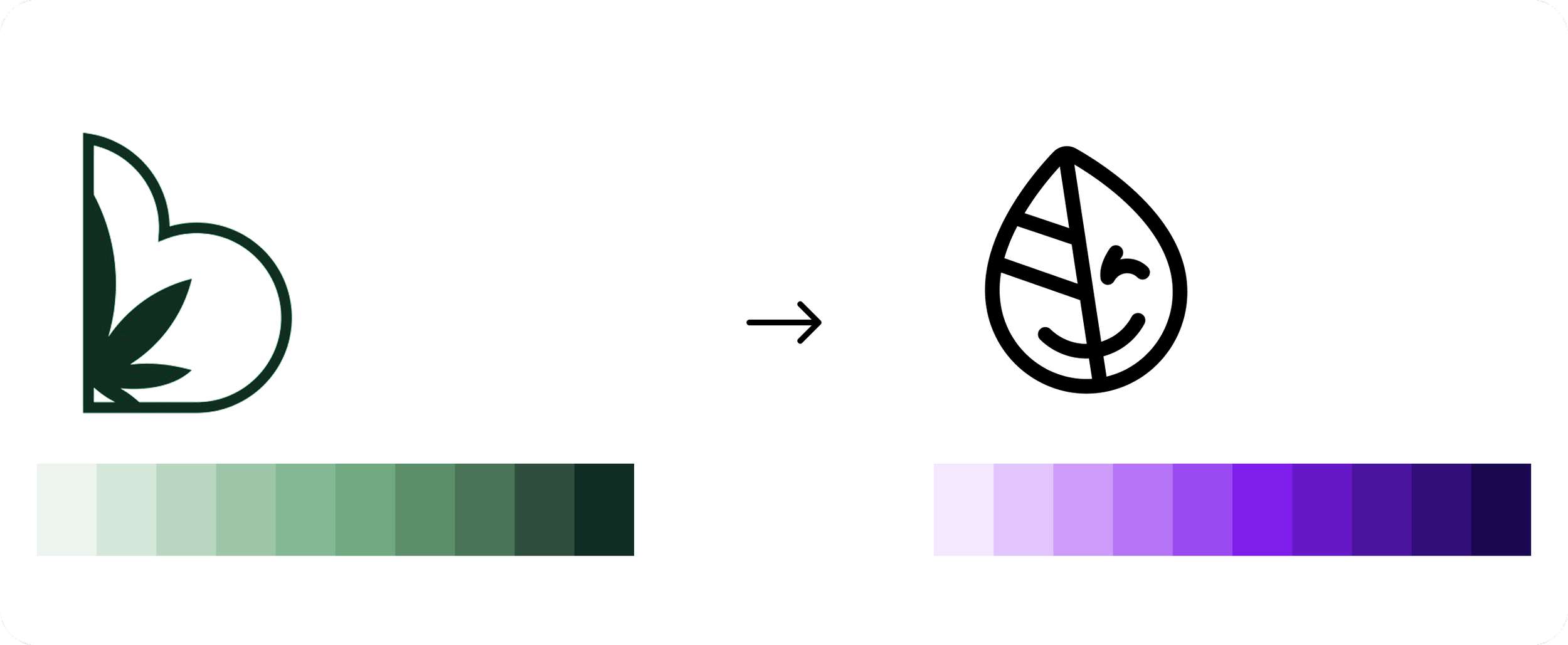
When I joined, Buddy already had a logo: a "B" mark designed to double as half of a cloud shape, so two marks placed side by side formed a puffy cloud. It came with three built-in states: default, discrete, and a "stoner" version with heavy, half-closed eyes. The founders were attached to the stoner version specifically. They thought it was funny and on-brand.
The problem showed up at production size. Scaled down to an app icon, the mark lost the cloud concept entirely. It just read as an oddly balanced B, and the stoner eyes became an even bigger liability at that scale: illegible, and reinforcing exactly the stereotype we were trying to move away from for a first-time, non-expert user.

Rather than trying to fix the existing mark, I proposed replacing it. I moved to a simple leaf, clean and legible at any size, with no cloud concept to preserve. To keep it from feeling flat, I gave it a small animation: on load, the leaf tilts and winks. Approachable and a little playful, without leaning on the stoner-culture cues the original mark relied on.
Color
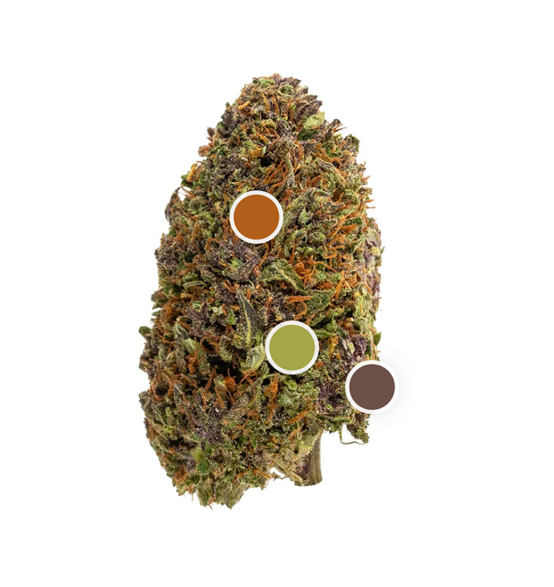
Every direct competitor was green. I mapped the actual color space cannabis lives in: green, purple, orange, the colors you actually see on a bud. I picked purple specifically to break from the pack. I also ran the existing green palette through a contrast check before proposing anything new. It failed WCAG AA across nearly every text/background pairing. The new palette passed. That gave me a second argument for the change that had nothing to do with taste.
Typography
I tested four typefaces, Poppins, Prompt, Kanit, and Inter, against the brand voice I was going for: friendly and a little bold, not clinical, not stoner-y.
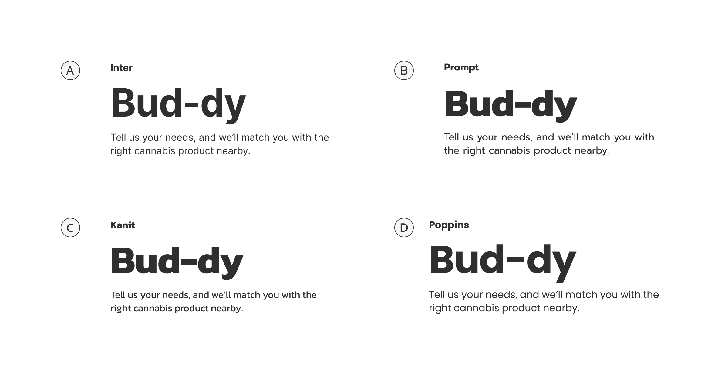
Selling it
The founders were attached to the original mark, so I didn't just present a new direction. I built a side-by-side comparison test, old vs. new, so the decision wasn't "trust my taste," it was "look at both and tell me which one does the job better."
Research & Product Framing
Before touching UI, I spent time understanding:
Matching apps (style, onboarding, quiz formats, discovery patterns)
Cannabis apps (Leafly, Weedmaps, Eaze, Jane, etc.)
How people identify preferences: effects, goals, flavor profiles, THC/CBD ratios
Since cannabis discovery isn’t mainstream or standardized, I wanted to see how others communicated effects and recommendations, and where Buddy could differentiate (e.g., tone, guidance, clarity, accuracy).
This helped me shape the product principles:
Approachable, friendly, permission-less.
Highly guided for new users but flexible for experienced shoppers.
Clear, structured flows with minimal cognitive load.
Visually bold, playful, and modern.
Creating Structure: High-Level App Map
I started by mapping the entire product at a structural level:
Top-level navigation (Home, Search, Match, Favorites, Profile)
Core flows (onboarding → matching quiz → results → product exploration)
Secondary components (favorites, reviews, shop linking, product categories)
This alignment step kept everyone on the same page and set up a clear path for engineering. Then, to keep the team unblocked, I created a Gantt chart outlining:
Design system foundations
Component reskinning
Full flow redesign
Engineering sequencing
As soon as design tokens and base components were established, engineers could start building while I continued moving through the UI.

Establishing the Buddy Design System
The first real milestone was establishing a strong design foundation.
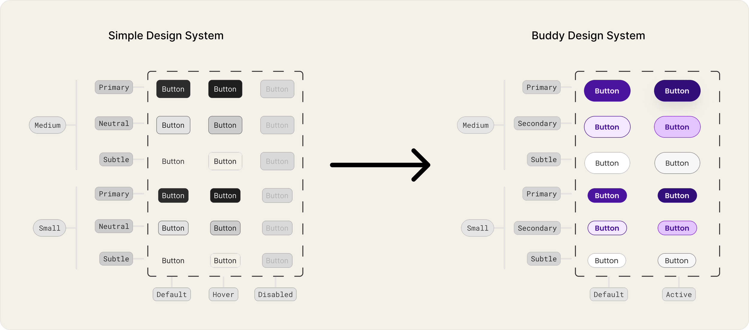
After collaborating with engineering, we decided to use React Native Reusables as a base and apply theming on top. This meant we needed a flexible, token-driven system that would scale.
I adapted Figma’s Simple Design System as a starting point and rebuilt the primitives:
Typography tokens: title hero, page title, subtitle, heading, body, etc.
Color tokens: semantic, accessible palette for backgrounds, text, borders, states
Spacing + radius + gaps: to ensure consistent modular layout
Shadow and effect tokens: to match the playful, slightly elevated visual identity
Reskinning Components
Once tokens were set, I reskinned the entire Simple DS component library:
Buttons
Inputs / text fields
Selects / switches
Alerts / banners
Cards
Navigation components
Modals / bottom sheets
I also selected a fun, approachable icon library that matched the brand we wanted: modern, playful, not “stoner-y."
The result: a fully themed component set ready for engineering to build against.
End-to-End Product Design
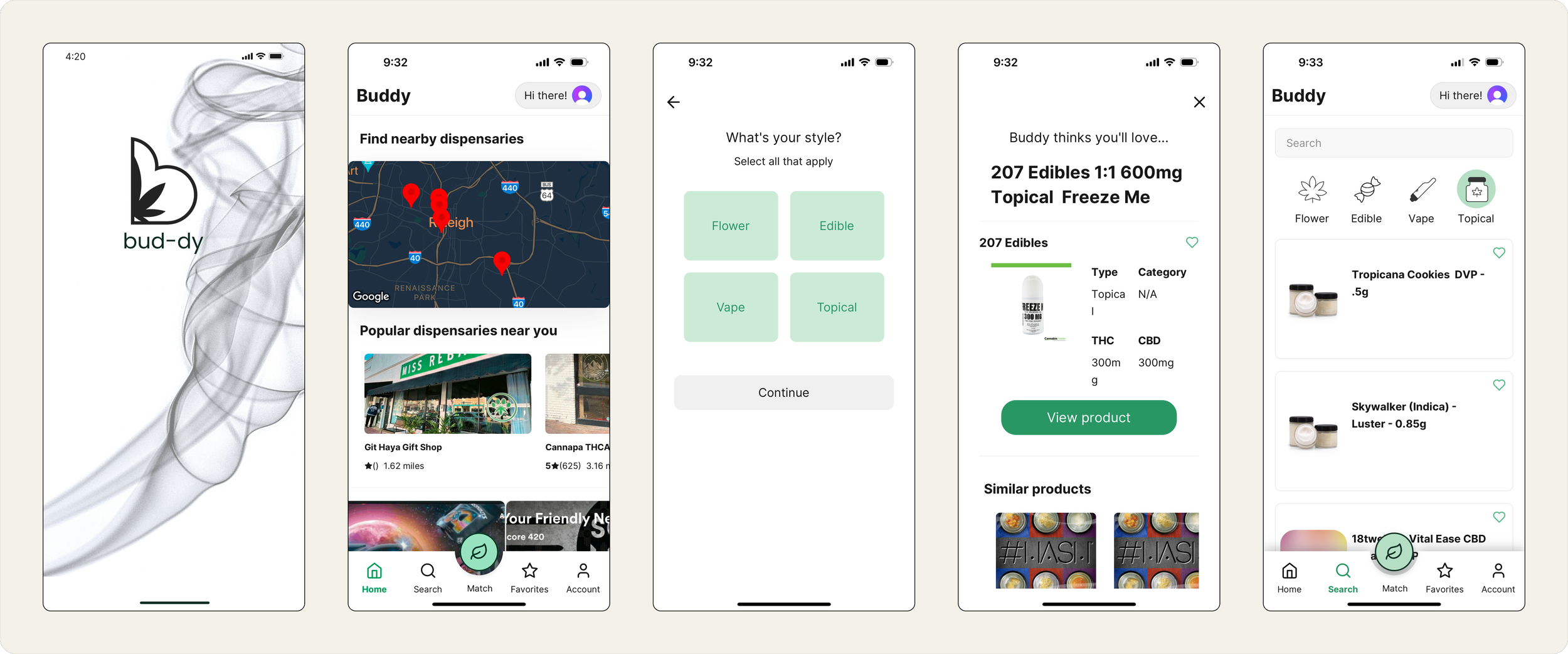
With the design system in place, I moved into redesigning the entire app experience. The original MVP had fragmented flows and an unclear value proposition, so a large part of my work was creating a cohesive, guided journey that made sense for both new and returning users.
I redesigned the entire product, including onboarding, matching, product discovery, shop information, search, favorites, reviews, account settings, and reservations. I approached this work as a unified ecosystem rather than a set of isolated screens. Every surface needed to reinforce clarity, trust, and ease of use.
The main goals behind the redesign were simple: Reduce friction and cognitive load for new cannabis users, create an experience that felt friendly and approachable, simplify complicated ideas like terpenes or strain effects, and connect personalization to real action.
I also spent a lot of time keeping the MVP realistic for engineering while leaving space for future growth.
The redesigned journey centered on a few core pillars:
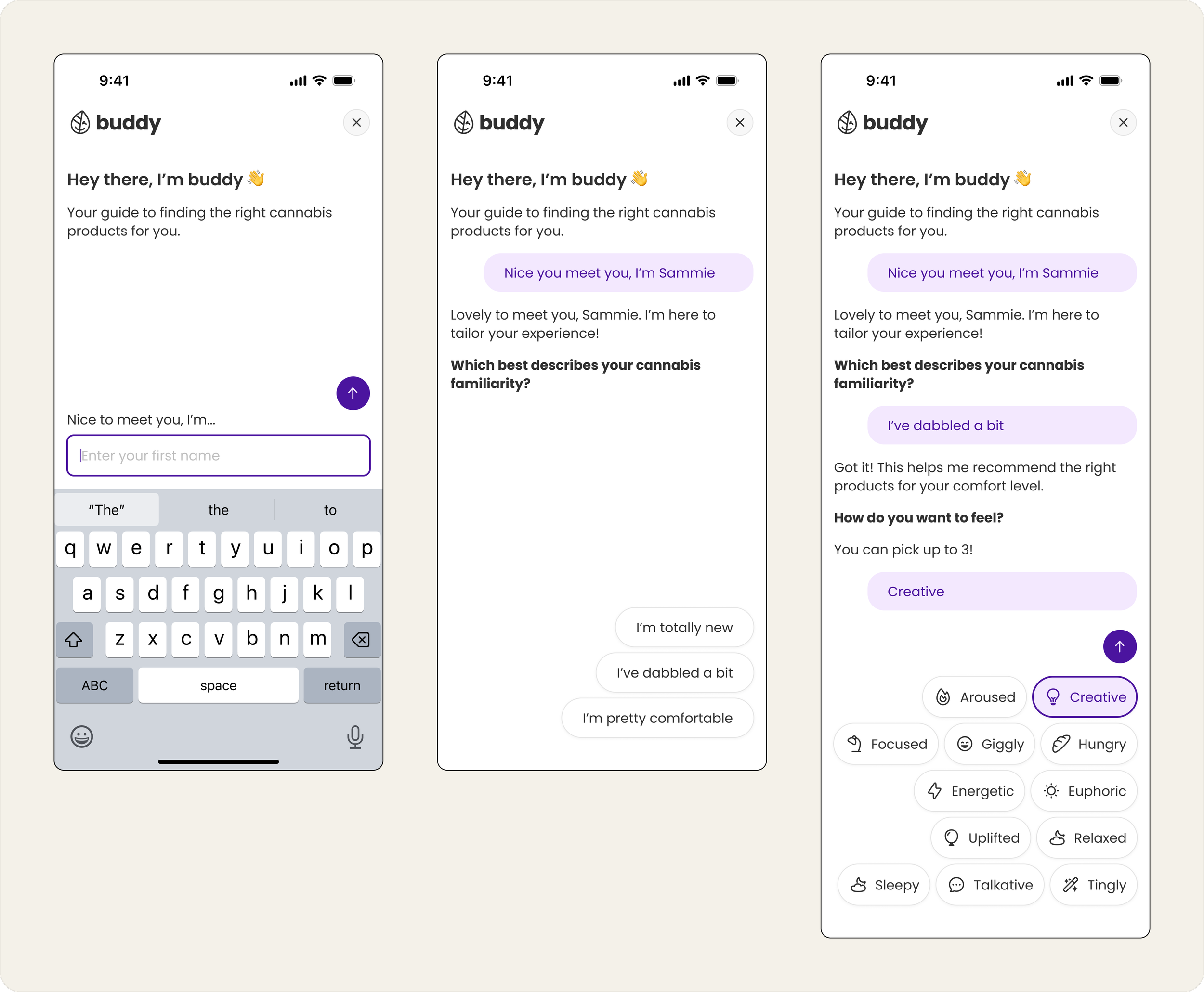
Guided Personalization: Signup leads directly into the matching flow. The experience feels natural and helpful rather than like filling out a form. This gives users value immediately and sets the tone for the rest of the product.
Clear and Lightweight Results: The match results intentionally surface only three recommendations. Each one comes with a clear next step such as reserving it, showing it to a budtender, or exploring more options. The goal was to give users confidence, not overwhelm them.
Product Understanding Without Heavy Reading: Product pages are designed to be scannable. Details like effects, terpenes, and benefits are tucked into expandable sections. Users can decide how much they want to read while still feeling supported.
Simple and Practical Dispensary Information: Shop pages work like lightweight Yelp cards. They show the essential information users need without forcing us to build a full product catalog system before the team was ready.
Search, Favorites, and Reviews in a Consistent System: Search, favorites, and private reviews all tie back to the match experience. Private reviews became a way for users to track how a product made them feel, which avoids moderation issues and provides real value.
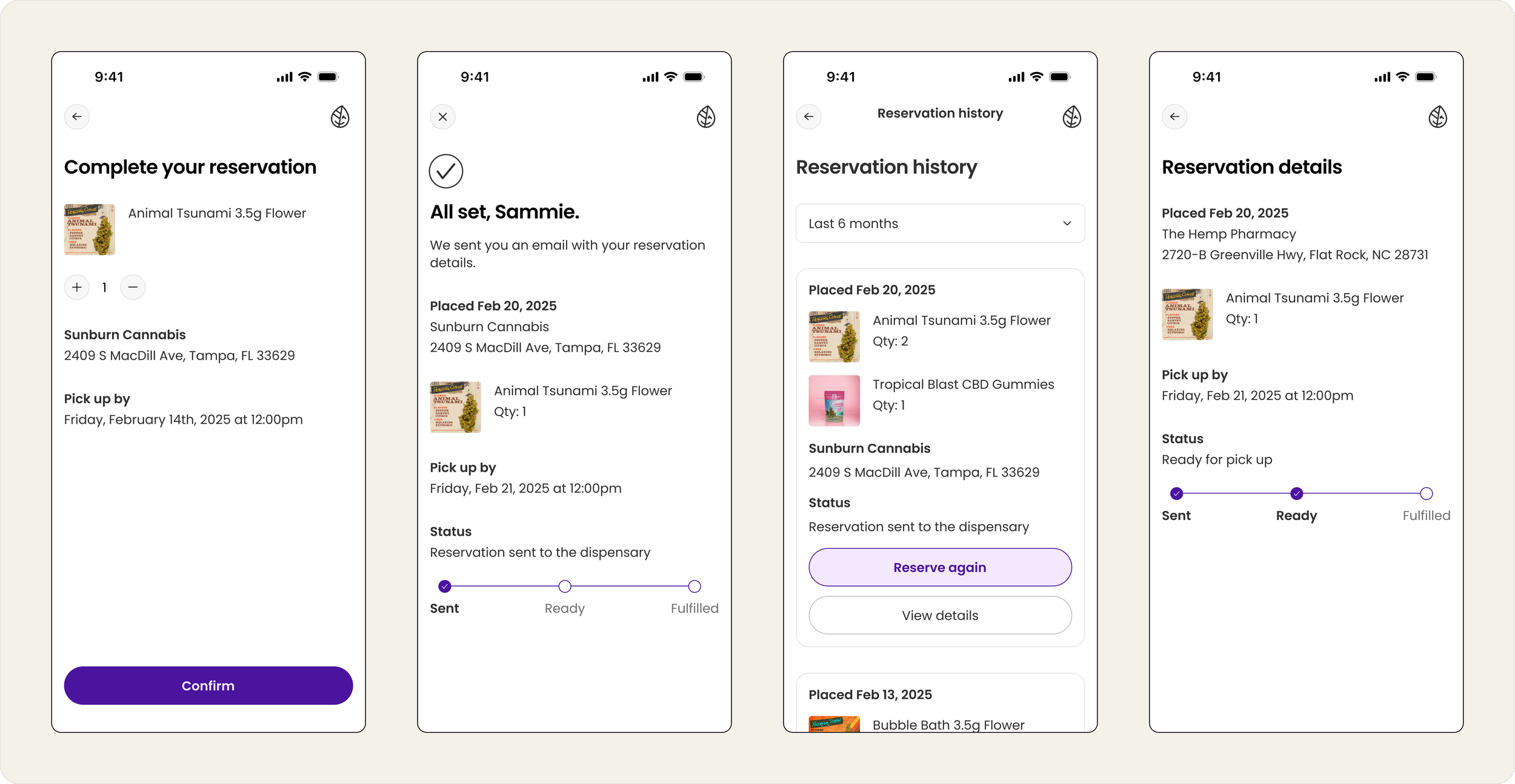
A Reservation System That Works for MVP: Dispensaries wanted reservations, which could have ballooned into a multi-shop cart problem. Instead, I designed a system that supports one shop at a time, keeps the UX simple, and works cleanly with engineering constraints. Reservations are tracked and grouped for users in the background.
In the end, the product became a cohesive experience that guided users from curiosity, to clarity, to action. Everything stayed within MVP constraints.
Pivots, Tradeoffs, and Product Decisions
Rebrand and Visual Direction
The original brand used a dull green palette that blended in with every other cannabis product. It had no real personality and did not support the friendly, guided experience we were creating. I proposed a fresh direction built around a simple, winking leaf logo and a new purple palette called Purple Haze. This made the product feel more modern, distinct, and a little cheeky. The founders were very attached to the old brand, so this required careful explanation, negotiation, and visual comparison.
Stoner Mode to Discrete Mode
The founders wanted a special stoner mode that transformed the logo into progressively “stoned” expressions. It was…fun? but not at all aligned with user privacy needs or long-term brand credibility. I recommended shifting the concept to a discrete mode that hides cannabis imagery and keeps the interface subtle. This path was easier to build and far more useful for real users. It became the final direction.

Public Reviews to Private Notes
The team initially wanted public reviews. I argued that it was too heavy for MVP and that private product notes would be more useful. Users could track their own experiences without adding moderation work or engineering complexity.
A Reservation System With Realistic Constraints
Dispensaries requested reservations. A real cart system would have required cross-shop coordination and complex logic. Instead, I designed a system that handles one shop at a time and keeps the rules simple. Reservations are grouped server-side so the user experience still feels organized.
Future Direction: Chatbot with AI Potential
I explored a conversational chatbot that I felt could evolve overtime to a smart Ai-driven system. To my surprise, the founders were very against this.
Closing
Buddy was a chance to define a product from scratch and to bring a scattered MVP into a real, cohesive experience. I built the design system, redesigned the app end-to-end, and helped guide the product toward something more approachable and intentional. It sharpened my skills in product strategy, brand development, and cross-functional collaboration, and it reinforced the type of work I love doing: helping young products grow up.