

Introducing A New Video Feature
The Problem
The leadership team at Duolingo’s was determined to reshape their mobile learning experience and reach new customers. Recognizing that leading competitors were utilizing video and micro-learning to expand their business platform, we were tasked with introducing video into Duolingo’s IOS mobile application.
The Solution
We created a seamless introduction to video by implementing video challenges into Duolingo’s free learning platform as well as creating a video library with exclusive content for Duolingo’s Plus members.
By offering exclusive access to the premium content for free for 7-days, users will be more likely to become Plus members. In addition, the incorporation of video into both the free and paid version would expand Duolingo’s reach within the language-learning market as well as create a more visual and enjoyable learning experience for their users.
My Role & Details
UI/UX, Visual Designer
Research Synthesis (Scope, Affinity Mapping, Personas, User Journey)
Rapid Prototyping (Sketching, Ideation)
Hi-fi Clickable Prototype
Project Duration: 2 weeks
Team Size: 3 members
Research
First, I wanted to discover how Duolingo was structured, how their users learned and what blocks, if any, users were facing along the way. These would be valuable insights when considering the best way to implement a new video feature.
How It Works
Duolingo’s learning system is organized into categories. Each category has 0-5 levels and each level requires completion of its lesson. Each lesson includes a variety of speaking, listening, translation, and multiple choice challenges.
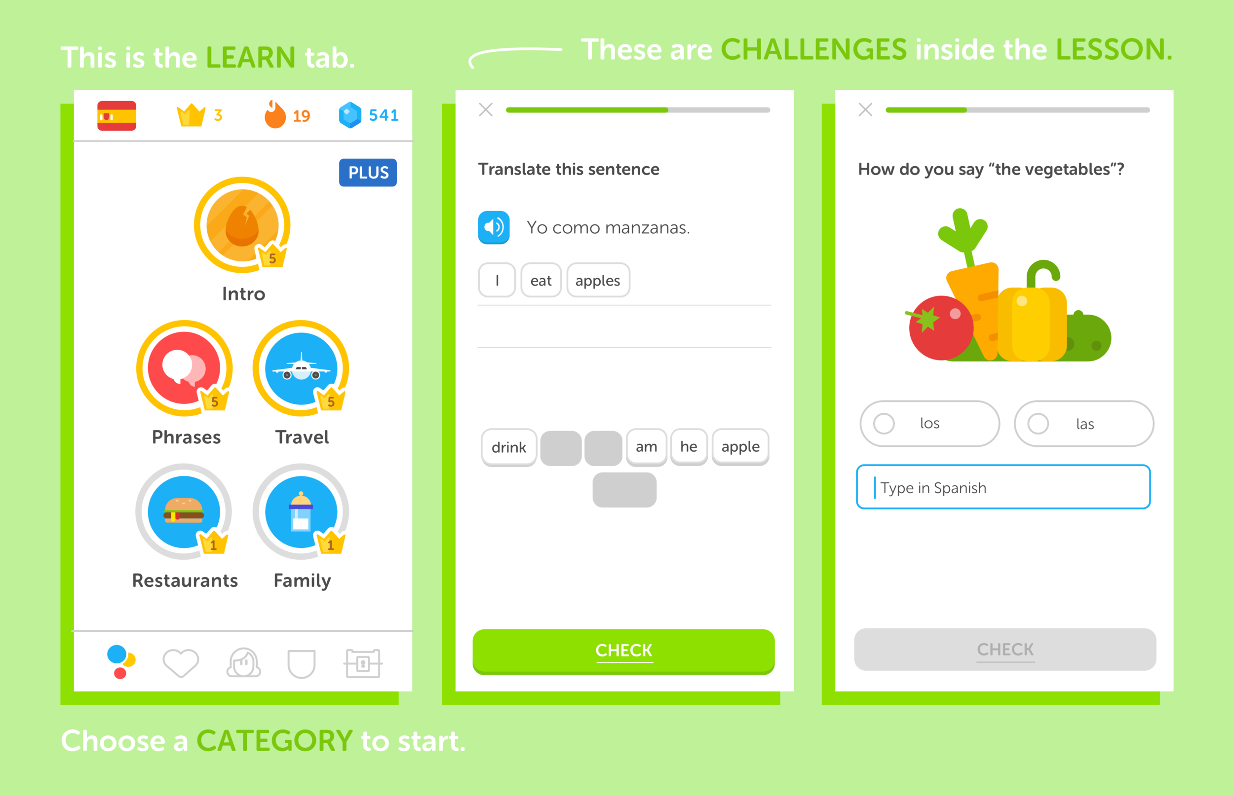
User Incentive for Duolingo Plus

Duolingo is free to use for everyone (this is part of their core mission), but they do offer a paid membership. With Duolingo Plus, users have access to features including:
An ad-free experience
Unlimited health
Monthly streak repair
Progress Quizzes
Ability to download lessons for offline use.
These are nice, but we felt there was a lot of opportunity for growth within this space.
Competitive Research
I analyzed prominent mobile, video applications such as YouTube, Vimeo, Instagram, and Snapchat to understand how they configure their UX/UI with video. I wanted to ensure our users would encounter an interface they were familiar with when watching videos on Duolingo.
I found the most inspiration from Vimeo’s UX. I thought it’s clean interface, top navigation, and video page layout would be great references when designing our new video feature.

User Research
We conducted user interviews to help narrow our focus. Together, we used affinity mapping to synthesize our findings, identify specific user needs and create a persona which was the manifestation of that data in a character.
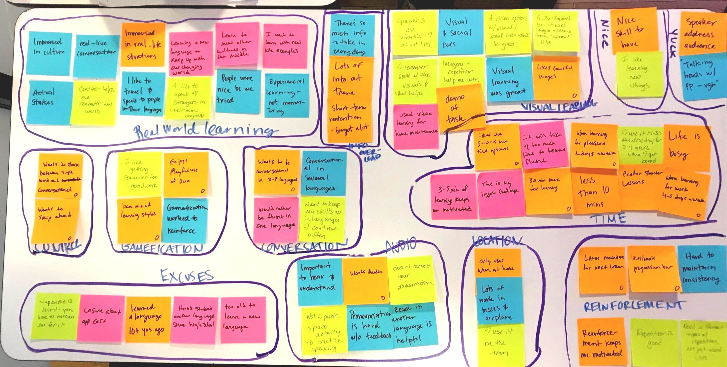

User Persona
Sean | Traveling Journalist
28 years old
“I like to be familiar with the language of the country I’m visiting.”
Wants to..
Speak a little bit of several languages
Spend 20-30 minutes/day in the weeks leading up to a trip
Learn while on public transit to and from work
Needs:
Visual and audible content
The option to discover content freely
Engaging rotation of learning challenges
Clear exit path
User Journey
Once we had our persona nailed down, I created a user journey to bring their story to life. Their journey would help us better understand who they were and what they needed.

User Flow
Creating a user flow helped us finalize how our video would be integrated into each learning lesson and how we might fold our premium platform inside a tab on the bottom navigation.
Our user flow illustrates how our new video feature would be integrated into Duolingo’s current flow.
The purple boxes represents our new video feature.

Sketching & Ideation
As a team, we did a design studio in order to generate several design solutions. The process was fun and we were able to come up with lots of different ideas.
CRAZY IDEA
Create an experience similar to a video game. User are taken on a journey through different countries and cities, encountering questions and adventure along the way. We quickly realized that while this idea was fun, it wasn’t our MVP, or minimum viable product because it would take considerable coding to create and implement.

A compilation of sketches from our video game concept .
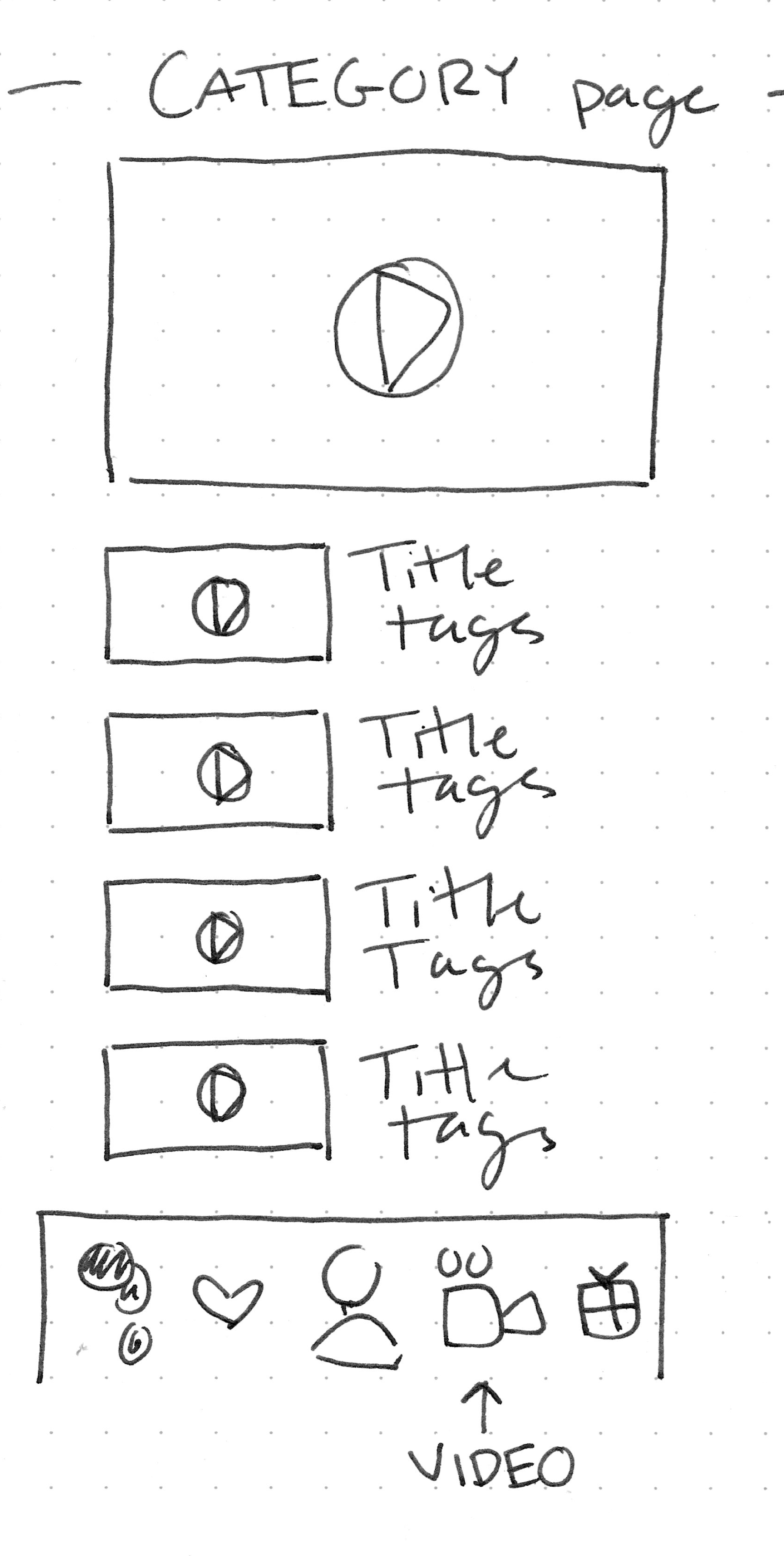
Sketching the UX
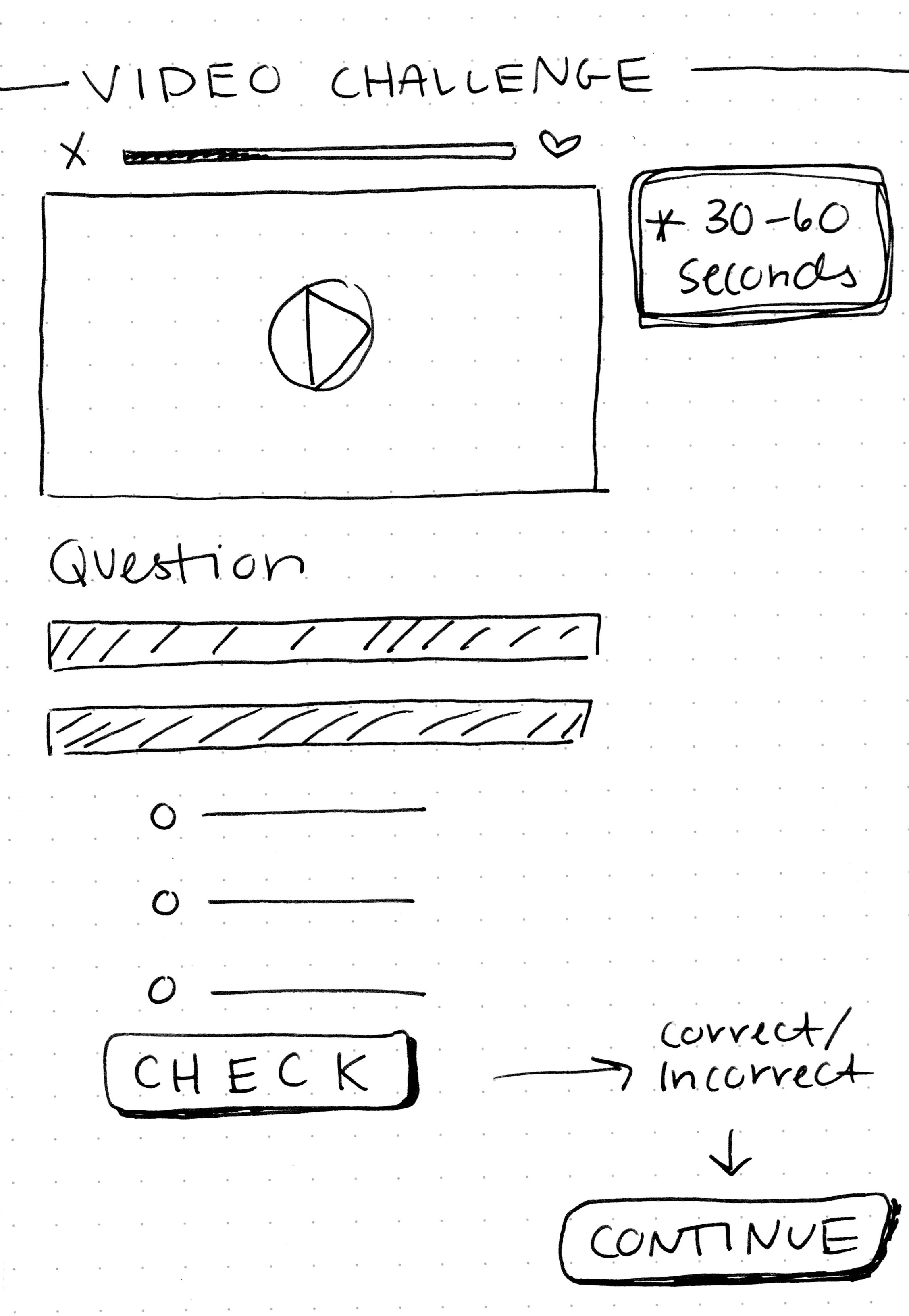
When thinking about the new, premium video library, I focused on the elements that were most critical. Referencing our competitive research, I felt that an EXPLORE page and a CATEGORY page would provide users with the freedom to explore and discover new engaging content. In addition, I sketched a video challenge page to integrate into the free lesson plans.
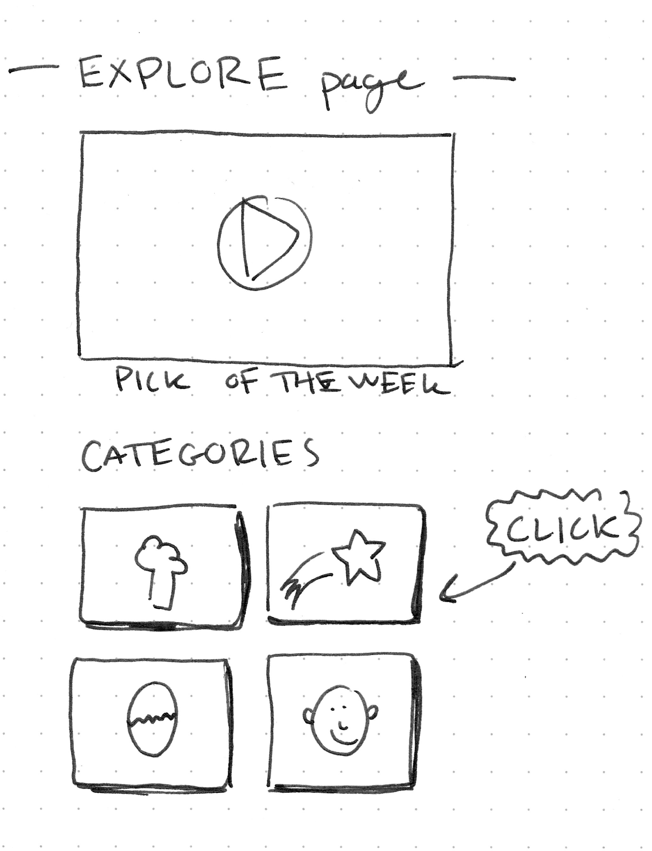
💡 IDEAS:
Place a featured or “Pick of the Week” video at top of the video challenge page.
Stack video questions in a scrolling format inside premium library
Fold video questions into an accordion inside premium library.
Create a video questions carousel in which questions slide in from the right one at a time
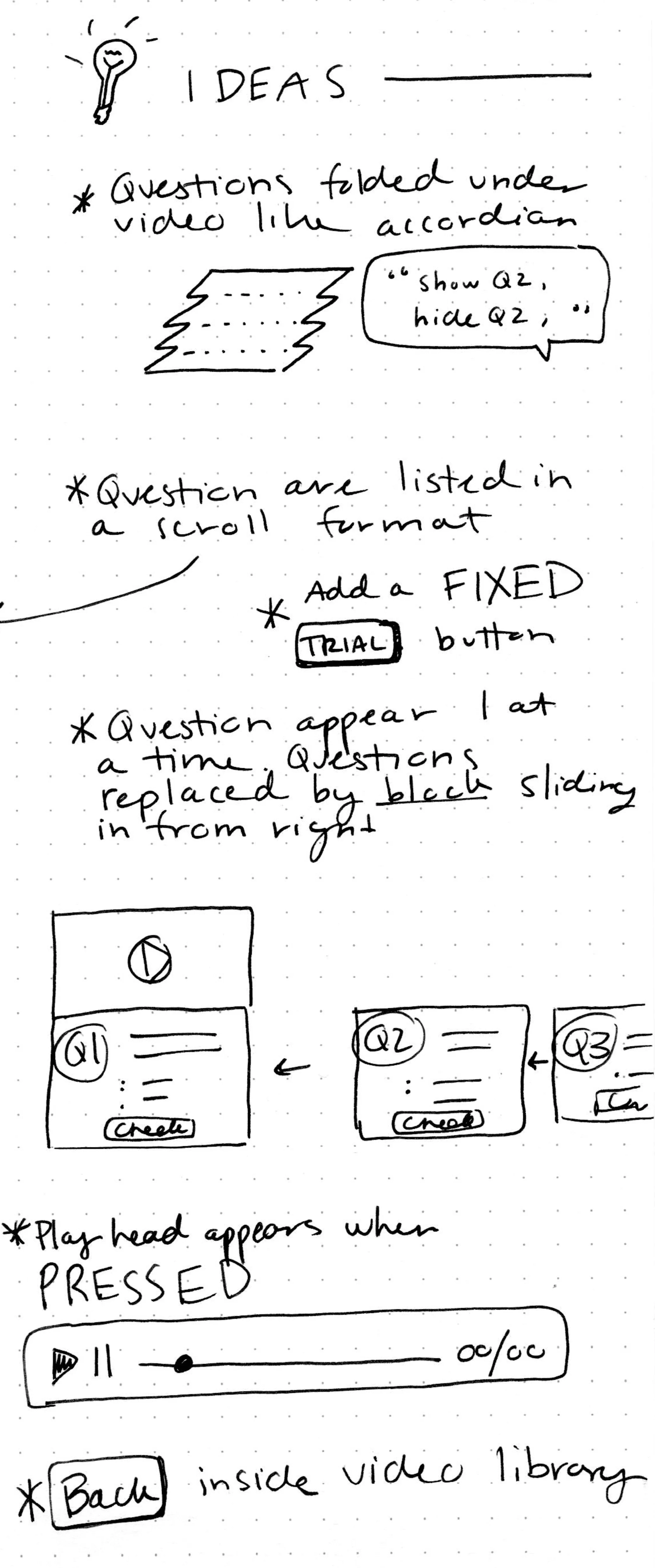

💡 More Ideas:
A back button inside premium library so user have a clear exit path.
A playhead which appears when users “press” the play.
A fixed TRIAL button on all the pages for users who are enjoying their free 7 days.
Wireframes
Based on our sketches, wireframes were created to bring the UX of our new video feature to life. We wanted to keep in line with the flow and aesthetic of the current platform. Our goal was to keep the user confident and the interface expected.
Recognition, consistency, and visibility were key factors when designing. Our competitive research of Vimeo and Youtube were referenced when thinking about placement and user experience.

Usability Tests
With the low-fi wireframes complete, we were able to create a clickable prototyping in inVison so that we could test and validate our design. We tested our wireframes on five users. The results of our tests gave me the insight I needed to implement changes as I moved forward with our hi-fi design. This was necessary in order to ensure the UI/UX was both beautiful and easy to use.
💡 Insight
Our wireframes included a quick tutorial informing our users of the features available in our new module.
Our usability tests showed us that users found this tutorial confusing.


💡More Insight
Our Explore and Category page both featured a video located at the top of the page - a similar layout to what you see when visiting YouTube or Vimeo.
Our usability tests showed us that our users were more interested in exploring or finding the content they wanted than watching a featured video.
Visual Design
The creation of a high-fidelity, clickable prototype was my next challenge. Not only did I need to iterate on the feedback from our usability test, I needed to define Duolingo’s strict style guide.
Luckily, Duolingo includes a detailed style guide on their website.
Colors
Duolingo makes education fun by using a wide range of playful and vibrant colors.

Typography
Duolingo uses Museo Sans Rounded because it gives text a fun and friendly feel to match their illustrations.

Iconography
Duolingo strives to create unique iconography by infusing symbols with their unmistakable illustration style. They avoid the generic, but their icons remain universally recognizable.

Illustrations
All illustrations are geometric and created with wholes, halves and quarters of four basic shapes. Restraint is shown when applying detail to prevent artwork from appearing noisy at smaller sizes.


Hi-Fi Prototype

Users can explore Duolingo’s different categories from the explore page.
One of our team goals was to create a beautiful and delightful prototype, so it was important to make the prototype look and feel like the real deal.
Working off our black and white wireframes, I brought our solution to life.
Explore Page
When thinking about how to bring our video feature to life. I wanted to reference the layout and design of Duolingo’s LEARN page. Instead of using circles, I chose rectangles with rounded edges. This kept the design clean and made it easy for users to select a category.
From there, users can explore the available videos or search from the search bar.

Users can see the different videos available inside the category page.

Once users select their category video, they can watch the video and answer the challenge questions.
Navigation
We wanted to give our new video feature a home on the bottom navigation. We chose to replace the GROUP feature (looks like a shield) with our new premium video feature.
Icon Design
I wanted to incorporate elements from Duolingo’s learn icon when creating the new video icon. I mimicked the colored bubbles to create an icon that matched their style and was easily recognizable.

The existing learn page is represented by an icon with 3 colored dots stacked on top of each other.

Our new premium video library is represented by a video icon with matching colors blue, yellow and red.
From the Explore page, users can select their preferred language in the top left corner.
From a CATEGORY page, users can search for a specific video by clicking the search icon in the top left corner.

This is the top navigation for the video category page.

Search bar appears when icon is CLICKED.
Advertising Our New Feature
Part of our task was to encourage users to become Plus members. In order to achieve this, I created an advertising page to give users the opportunity to start their 7 day trial.
We also wanted to inform users of where they were within their trial. To do this, I created a notification page that appears after each premium video challenge.

This is our video advertisement. It allows user to gain access to our new premium video content.

This page notifies user of how many days remain in their trial. Users will encounter page after each premium video challenge.
Next Steps
With only a short amount of time to deliver a finished project, it was important that we keep our focus narrow, our process lean, and consider the value of an MVP product. Feature prioritization was key to ensure delivery and success.
But! That doesn’t mean we didn’t parking lot (or set aside) a few feature we felt would be great to implement moving into the future for our premium members.
Social sharing
Offline mode
Bookmark feature so user can save video for later
Final Thoughts
It was exciting to work on a project that plays a small part in making the world a happier and more connected place. It was even more exciting discovering and creating a solution to make their platform more fun and engaging for users.